I recorded myself for nine months. 316,154 words. One surprise.
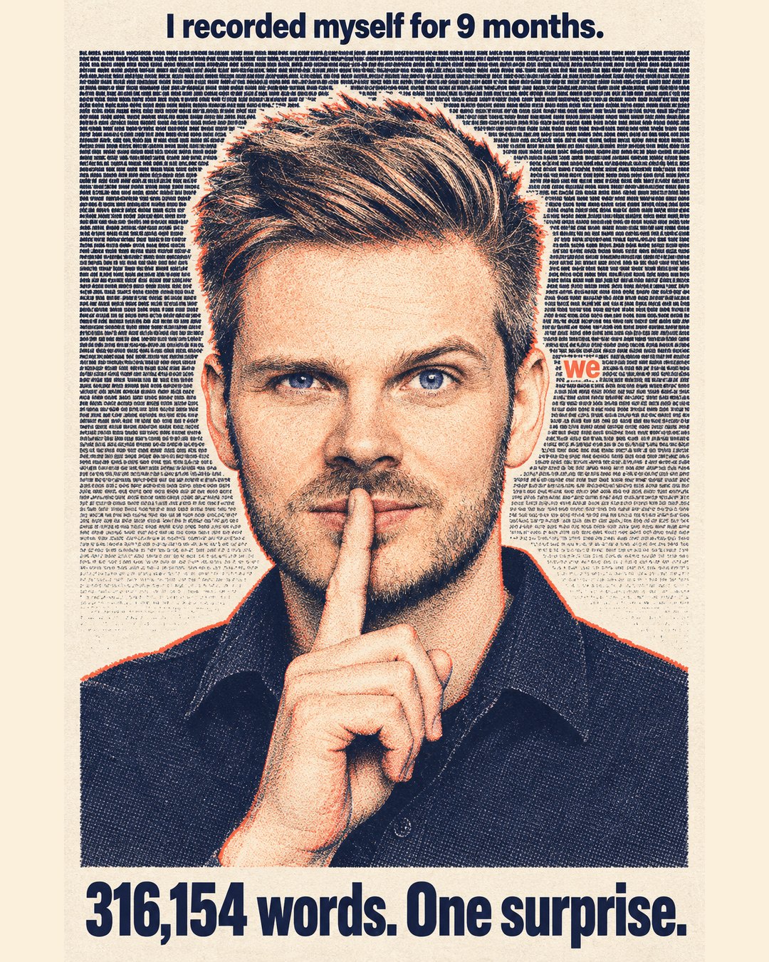
Since last Christmas, I dictated every working thought into a tool I wrote myself, day by day. The analysis here gives you the charts and the method: how each number was computed, what the happiness score is, and all the findings.
My expectations: meetings wrecking my day, grey weather dragging me down, load climbing. Mostly not there. What showed up is weirder. The word "I" fell by half without me noticing, admin days cost about four points of mood, and I sound most frustrated at the first hour of work and the hour I hand things over.
What I recorded, and how
The capture tool is NeuroWhisper, a small open-source Windows app I built for myself and our team. Hold a hotkey like F8, talk, release, text lands wherever the cursor is. Transcription runs locally through faster-whisper or OpenAI's transcription API. Nothing about it is clever. It removed enough friction that I actually use it a lot.
Longest unbroken streak 20 days, longest gap three. Of the 47 days in range with no dictation, 31 were Saturdays and Sundays. So this is a record of my working head, not my life.
The 275,054 words that were not mine
The first pass said I had dictated 591,208 words. Better headline, but completely false.
Twenty recordings out of 5,806 contained 275,054 words between them. In each, the mic was open on silence or background noise and the transcription engine looped, repeating variations of "trained on data up to October 2023" for thousands of lines. Classic ASR hallucination on empty audio. The machine was filling the void with its own boilerplate.
The lesson. 0.3% of records carried 47% of the apparent volume. Any analysis on the uncleaned file (words per day, vocabulary growth, the whole output story) would have been dominated by twenty pieces of machine noise, and the charts would have looked plausible. The detector is a shingle-repetition test: if a long entry's overlapping word-windows repeat above a threshold, it is a loop, not a person. Before analysing a corpus you generated automatically, sort by record length and read the top twenty by hand. Every time.
How a day becomes a number
Each day's transcripts went to Claude Sonnet, which returned a structured label: a mood phrase, a 0–100 happiness score, topics, projects, activities, and the share of the day spoken in German. That gave 220 labelled days out of 231 dictation days; eleven failed to produce a usable label and were dropped rather than guessed. Every mood chart here rests on that score.
The happiness score is an LLM judgement. No norms, no test-retest reliability, no validation against a PANAS or a daily self-report. One model's reading of how a day sounded, on a scale it was handed. It is internally consistent (same prompt, same model, same kind of input, 220 times), which makes differences between days worth looking at. The number is not comparable to anyone else's, cannot tell you I was "61 out of 100 happy". It is a consistent thermometer with an unknown zero point.
The rest is ordinary data work. The 1,518 topic phrases were embedded with text-embedding-3-small, clustered with k-means at k=12, and the twelve clusters read and named into eight categories by hand, merges and failures documented. Calendar data came from Google Calendar, weather from the Open-Meteo archive. Pronoun, frustration and question rates are closed word lists counted over the raw transcripts, English and German together. The drivers model is OLS with standardised predictors.
What I found
1. My day has two peaks, and Tuesday is the loudest, measured by words spoken.
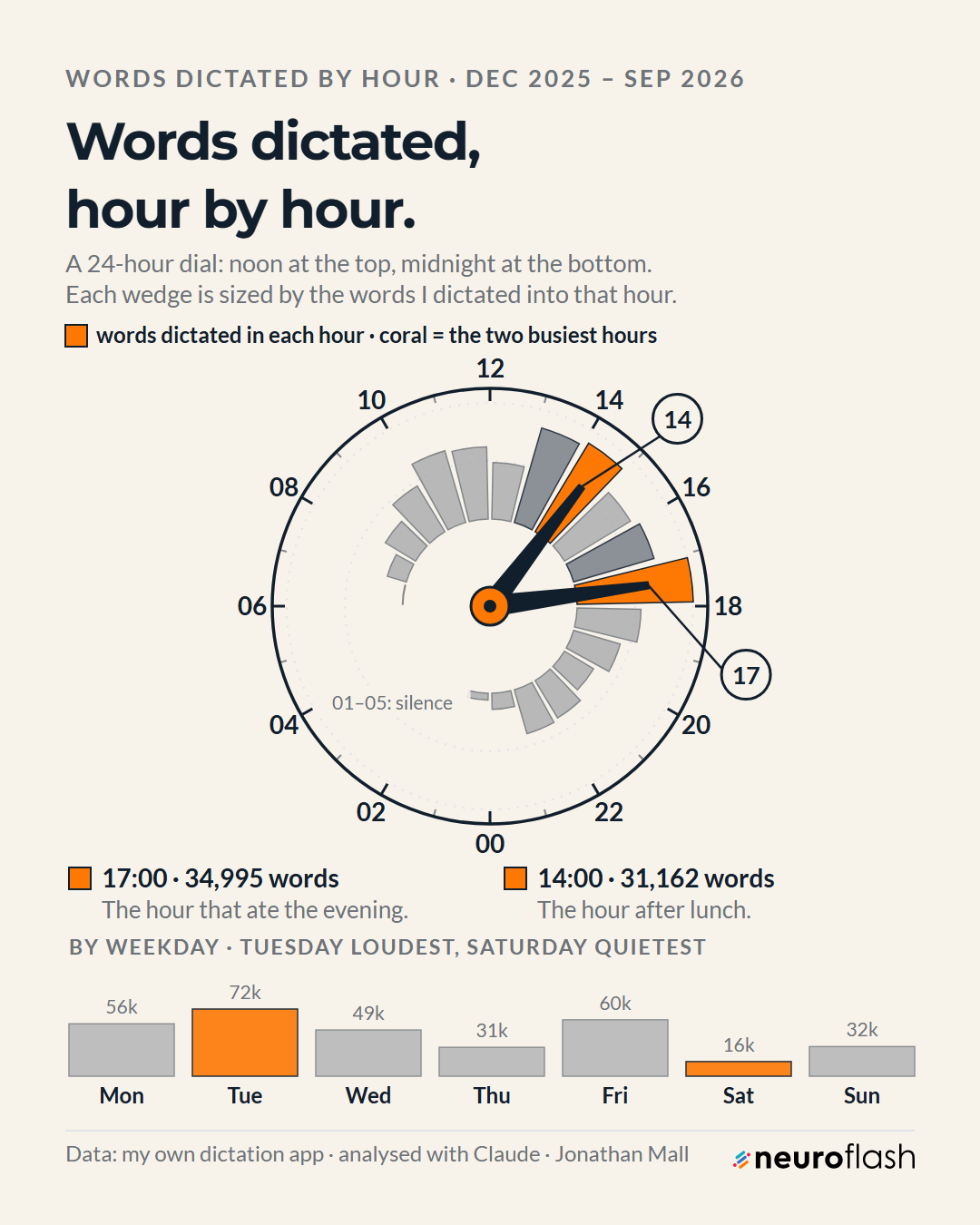
The post-lunch hour and the end-of-day hour. Nothing between one and five in the morning, the most reassuring finding in the set. Tuesday's 72k words against Thursday's 31k is a wider spread than I expected, and Tuesday turns up again later as my worst mood weekday. Talking most and feeling best are not the same axis.
2. I say "I" half as often as I did
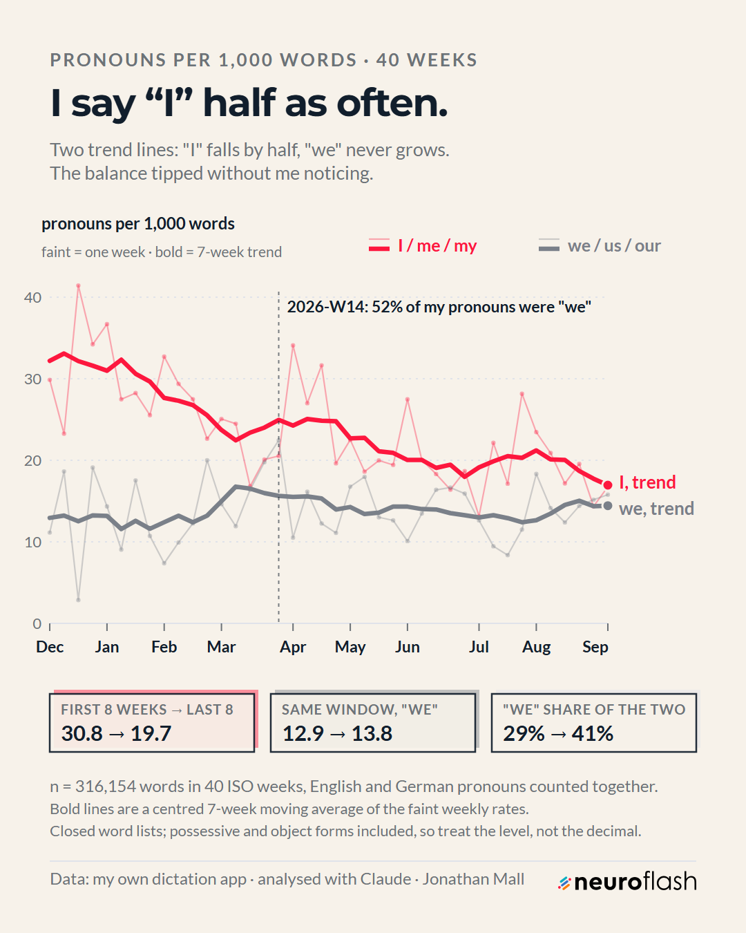
This one changed how I think about the year. "I / me / my" went from 30.8 per thousand words to 19.7. "We / us / our" barely moved: 12.9 to 13.8. The "we" share of the two rose from 29% to 41%, almost entirely because the "I" fell away, not because a "we" arrived. In week 14 of 2026, 52% of my pronouns were plural, the peak of the series.
I did not notice it happening. A drift of roughly one word in a hundred over nine months is invisible in the moment and only obvious as a pattern in aggregate. If you want one argument for recording yourself: the changes worth knowing about are the ones our brains can't feel.
3. What I spent my head on
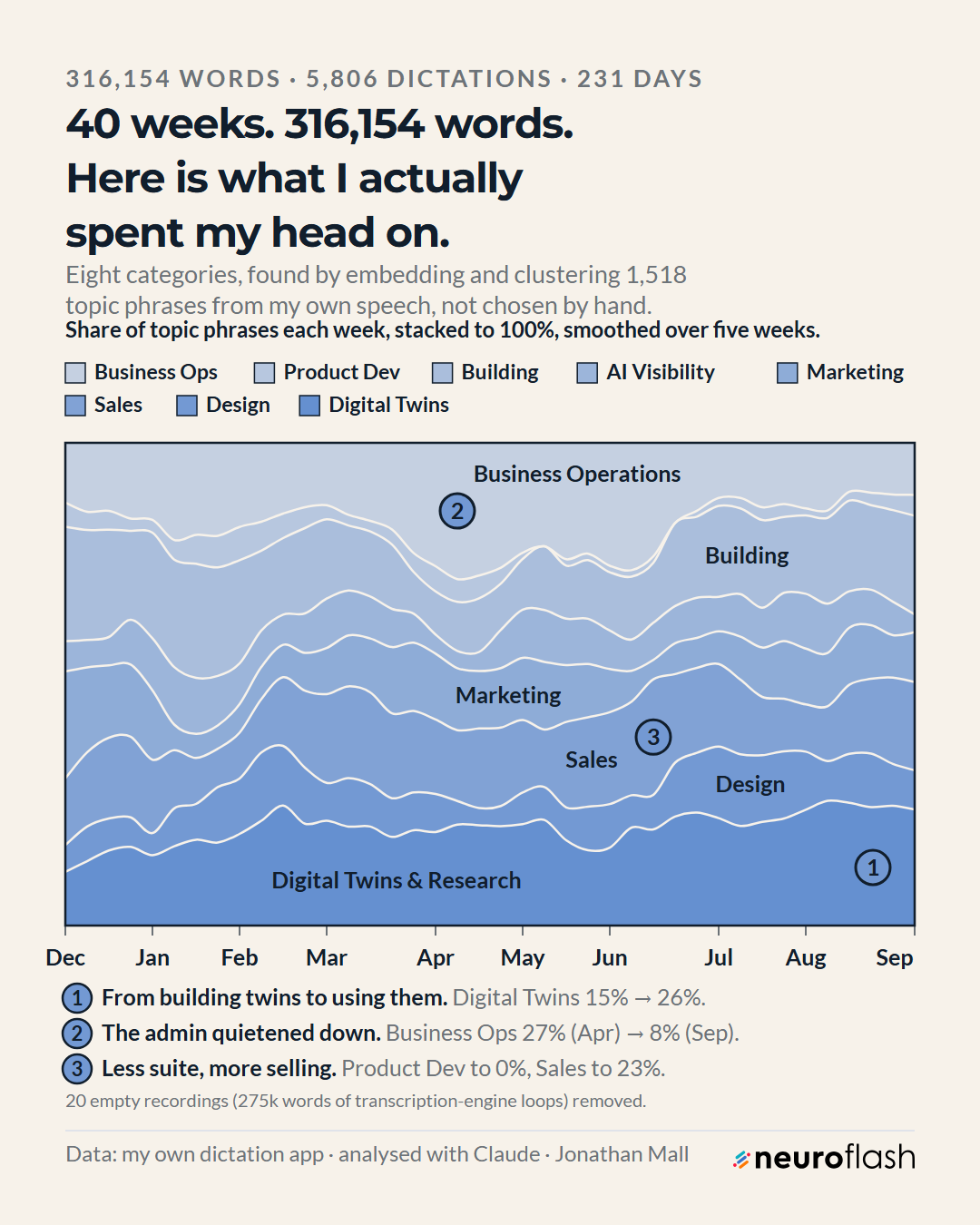
Digital twins and research went from 15% to 26% of my attention. Business operations (contracts, scheduling, client admin) fell from 27% in April to 8% in September. Hands-on product development went to roughly zero across the pivot months of June and July, while sales and commercial strategy climbed to 23%.
The caveat came from the clustering itself: these categories are made of how I phrase things, not of what I did. One cluster separated almost purely on language (non-English client correspondence clumped together regardless of subject) and had to be merged by hand. Embeddings cluster style as readily as substance. And "personal life" never formed a cluster at all. My hand-made category scheme would have invented one.
4. The psychologist in me
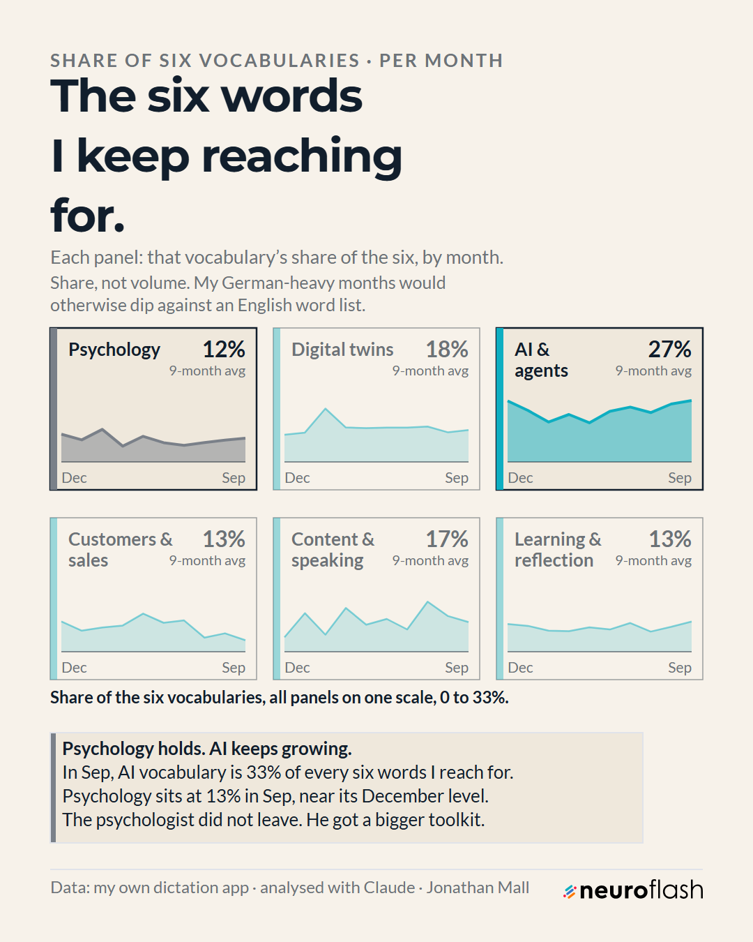
AI and agents vocabulary averages 27% of those six and reaches 33% by September. Psychology language averages 12% and sits at 13% in September, almost exactly where it was in December. I had assumed the AI vocabulary was crowding the psychology out. It was not. It grew into space the other themes gave up.
5. Nine months inside a ten-point band
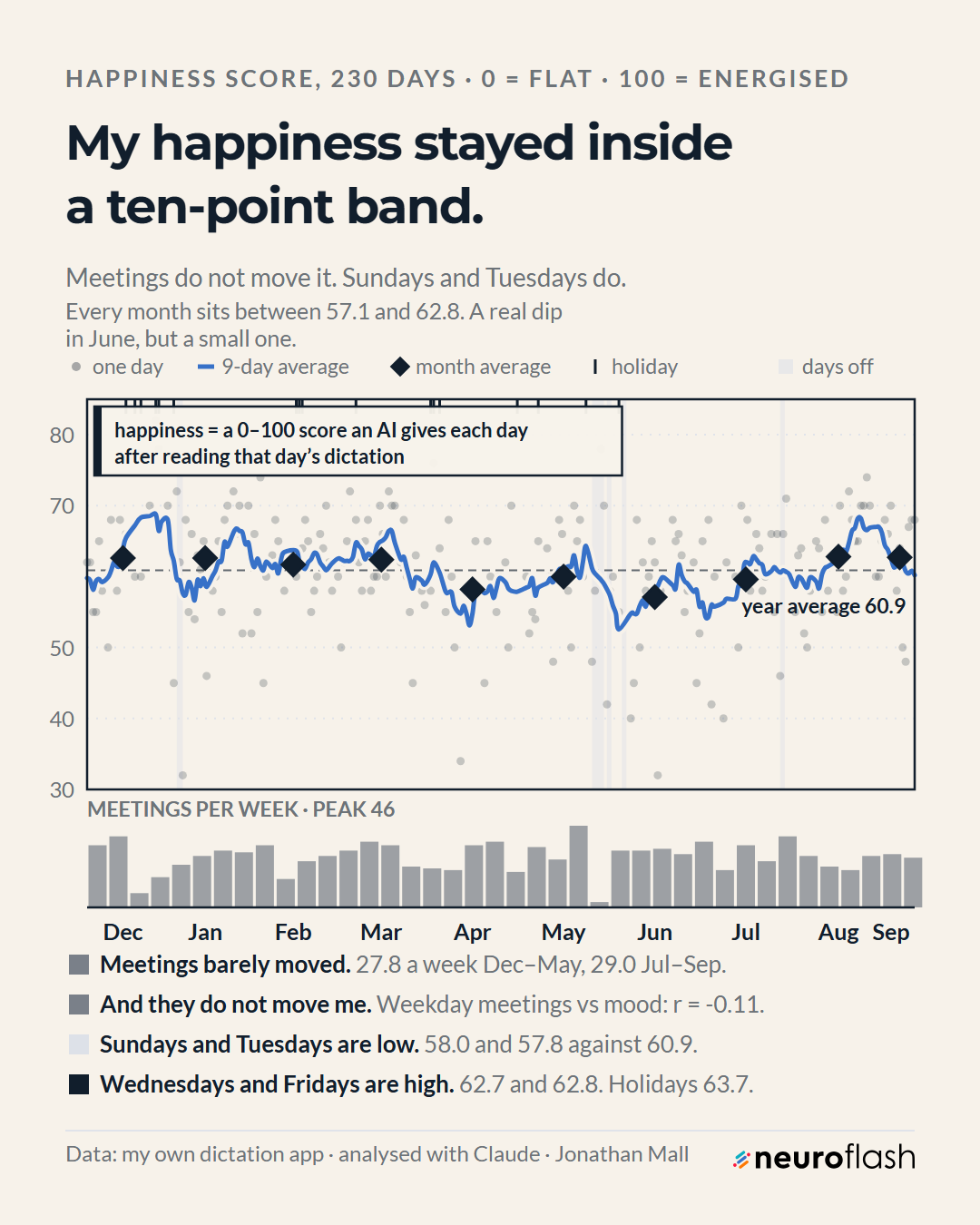
Meetings ran at 27.8 a week from December to May and 29.0 from July to September, peaking at 46 in one week. Weekday meetings against that day's mood: r = -0.11. Sundays (58.0) and Tuesdays (57.8) sit low; Wednesdays (62.7), Fridays (62.8) and holidays (63.7) sit high. Visible dip in June, and I am not going to over-read a two-point monthly move in an LLM-generated score.
6. Admin days cost about four points of happiness
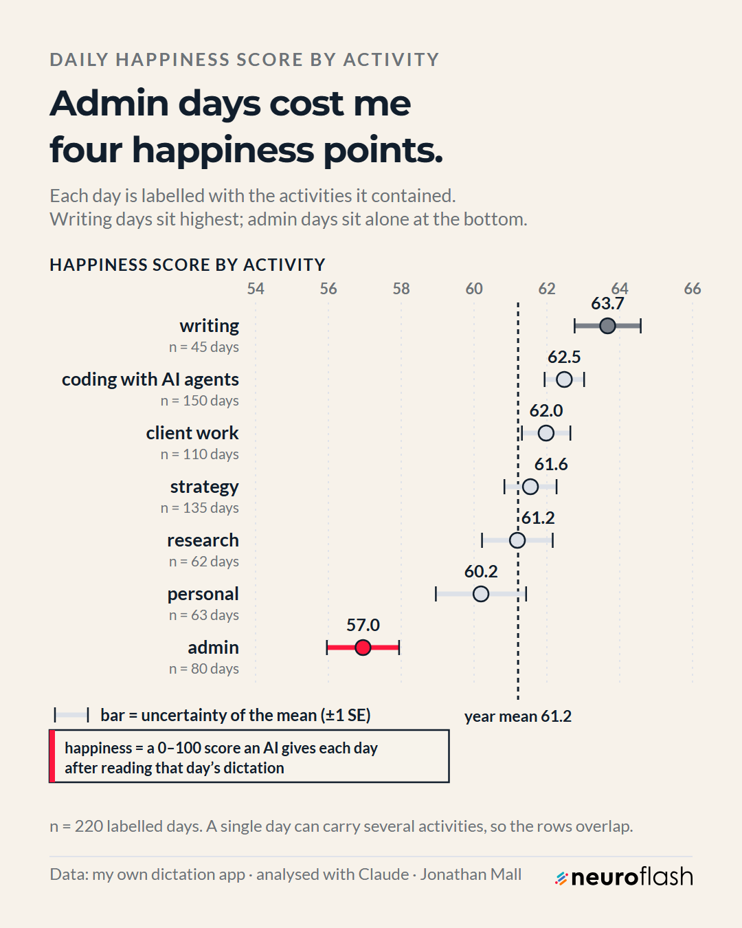
Writing days average 63.7 (n=45), admin days 57.0 (n=80). Everything else (coding with AI agents 62.5, client work 62.0, strategy 61.6, research 61.2, personal 60.2) sits in a band so tight the error bars swallow the differences. The one separation I would defend is admin against everything else, worth about four points across 80 days.
7. The mood regression
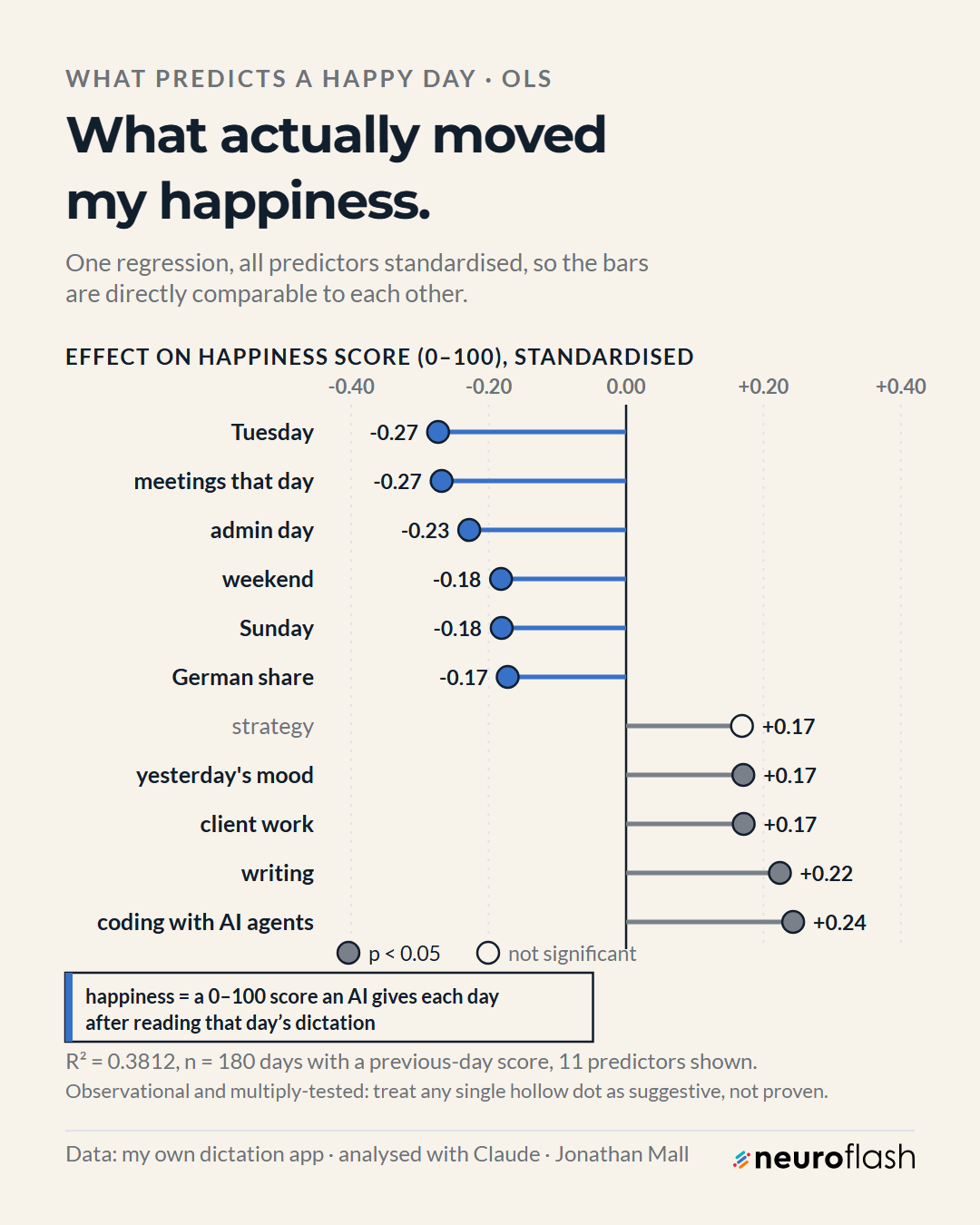
Coding with AI agents (+0.24) and writing (+0.22) pull up. Tuesdays and same-day meeting load (both -0.27) and admin days (-0.23) pull down. Yesterday's mood carries +0.17, the least surprising result in the study and the most important control in the model.
Multiple comparisons. More than twenty predictors, 220 days, one person. At a 5% threshold roughly one in twenty null predictors clears the bar by chance. A single significant coefficient here is a hypothesis only. The pattern that survives three independent views is the one to weigh: the activity dot plot, the regression and the raw monthly means all say admin is the low point and making things is the high point.
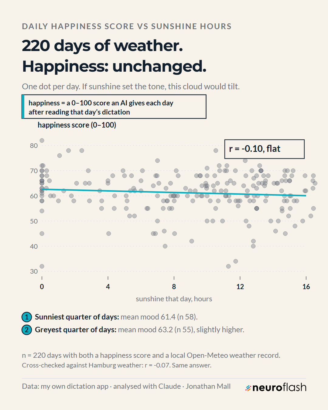
8. Weather: nothing
9. The meeting hangover I could not find
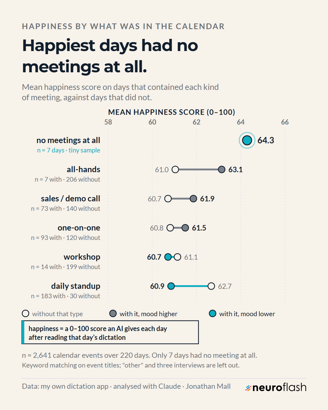
Days with a daily standup average 60.9 against 62.7 without; days with an all-hands average 63.1 against 61.0 without. Every gap here is one to two points, inside the noise for samples this size. The only large number is the no-meeting row, and it has n=7.
10. Frustration has two spikes, early and late
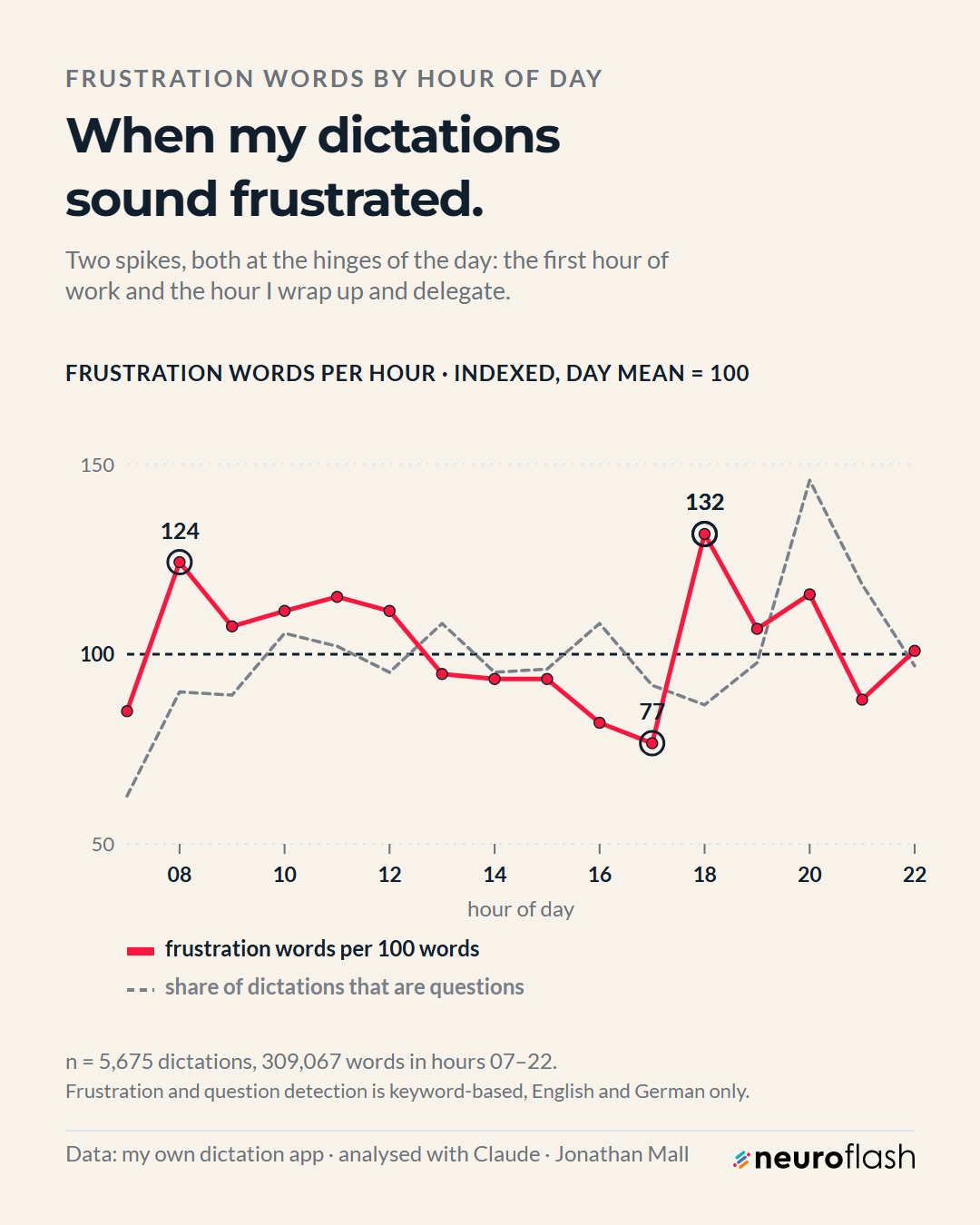
Two spikes: 124 at eight in the morning, the first hour of work, and 132 at six in the evening, the hour I wrap up and hand things over. The calmest hour is 17:00 at an index of 77, also the hour I dictate the most words. Deep in the work I sound fine. At the hinges, where things start and where things get passed on, I sound annoyed.
What I would not conclude
- That sunshine does not affect mood. One person, 220 days, one city, one LLM-generated outcome. In this archive, sunshine hours carry no usable signal about how my working day sounded. A null result on my data, not a fact about humans. Maybe I was just talöking to AI too much to notice the sunshine.
- That meetings are fine. The same-day cross-correlation between mood and meeting hours is 0.0074, which is nothing. Next-day mood after a six-plus-meeting day is 61.45 (n=101) against 60.58 after a light day (n=48), so the hangover runs slightly the wrong way, on unbalanced samples. Meanwhile the regression puts same-day meeting load at -0.27. Those do not agree, and when measures disagree the answer is "undetermined".
- That no-meeting days make me happy. Seven days. An anecdote, but it fits my feelings about meetings.
- That any of this generalises past me. n = 1. A case study in method, not a result about knowledge work in general.
Digital Twins helped to create these result visualizations: I ran the boards past a synthetic focus group first: 13 DACH marketing digital twins, 161 answers. Across five boards their most repeated confusion was that nobody knew what "happiness score" meant, because nobody reads the caption under a chart. Hence the definition sitting inside the plot area on every mood figure above. Their second note: a headline reading "I stopped saying I" overclaimed a line that never reaches zero. They were right, and it changed.
How to do this yourself
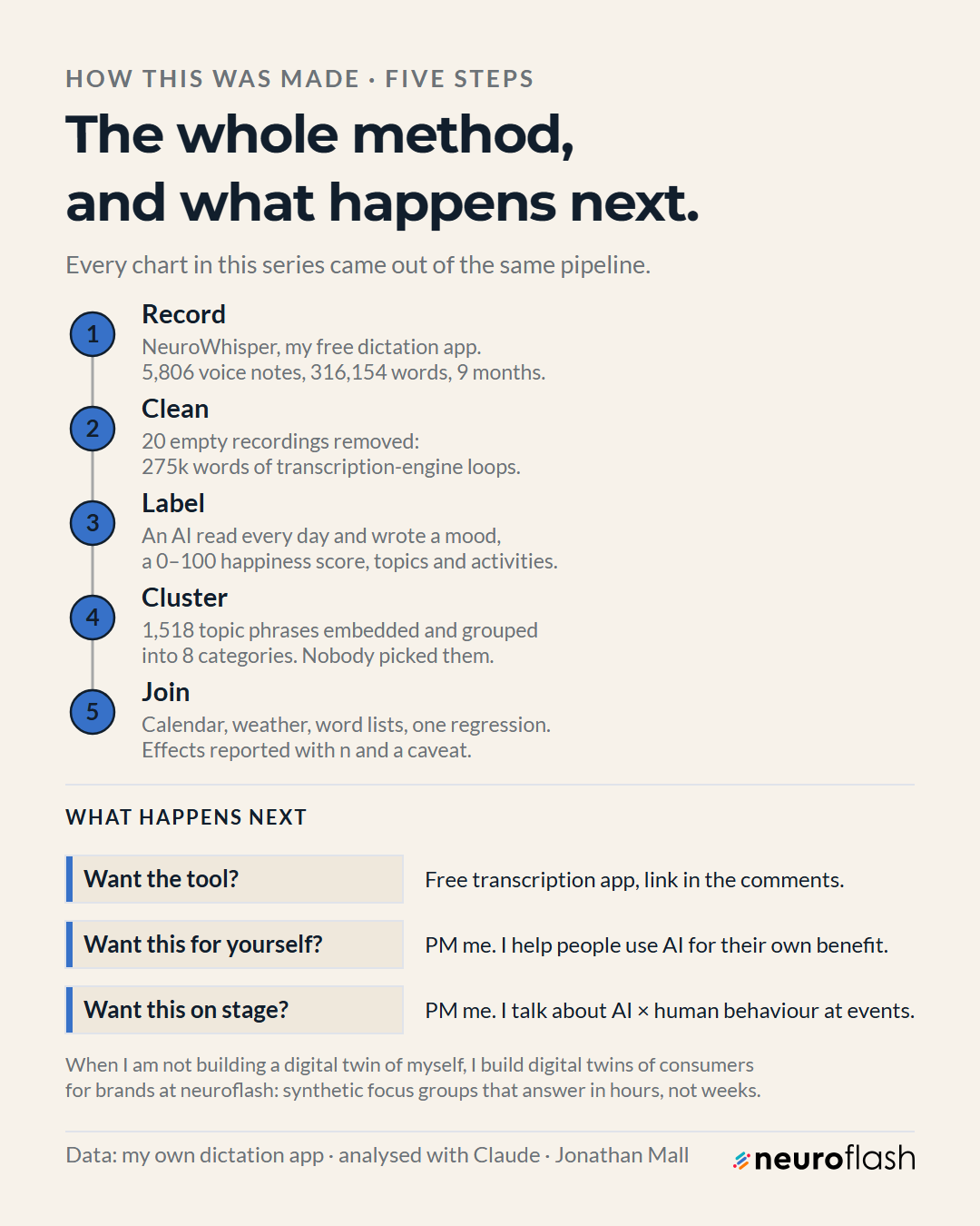
Six steps, and the API bill is roughly the price of a coffee. The expensive input is nine months of your own attention.
- Capture. Install NeuroWhisper, bind a hotkey (I use F8), talk. Local faster-whisper costs nothing per word and keeps the audio on your machine, if you have the specs for it. Write timestamped text files to a plain folder. Do not build a database.
- Clean first, always. Sort records by word count, read the top twenty by hand, add a repetition test for looping transcription. My rule: an entry above 300 words whose overlapping word-windows repeat above 40% is machine noise.
- Label each day with an LLM. One call per day, the day's text in, structured JSON out. Keep the prompt byte-identical across the period or your scale drifts under you. At current Sonnet list prices, 316k words in plus 231 short JSON outputs is a few dollars total.
- Cluster the topics instead of naming them. Embed the phrases (
text-embedding-3-small; 1,518 of them cost a fraction of one cent), k-means, then read the clusters and name them yourself. - Join the boring context. Calendar export, weather archive, holidays. This is where "is it me or is it Tuesday" becomes answerable.
- Analyse, then argue against yourself. Report n on every claim, standard errors on every mean, and how many predictors you fitted before quoting a p-value. Then publish the findings you would not defend.
Cost: transcription free locally, labelling a few dollars across nine months, embeddings a fraction of a cent, weather and calendar free. The barrier was never the bill or the compute. It was a capture tool frictionless enough that I still used it on day 180.
Questions I get asked
Is the happiness score real?
Real in the sense that it is computed the same way every day from a real input. Not real in the sense a validated psychological instrument is: no norms, no reliability testing, no comparison against my own self-report. It supports "admin days score about four points lower than writing days on this scale". It does not support "I was 61% happy in March". Use it for differences, never for levels.
Why not just keep a journal?
A journal is written after the fact, by the part of you already constructing a story. Dictation happens mid-task, inside the sentence you were thinking anyway, 5,806 times. No journal entry would ever have recorded "today I said 'I' slightly less often than last spring". That finding only exists at 316,154 words.
Is this not a privacy nightmare?
It is a considered trade. Transcription can run entirely locally and the archive is plain text on my own disk. The labelling step does send text to a model, so anything I would not want processed that way never enters the corpus. Decide that boundary before you start, not after you have 300,000 words.
The tool is free. Take it and run your own nine months.
NeuroWhisper is open source: local or API transcription, one hotkey, plain text out. No account, no cloud. If you want to talk about what this kind of measurement looks like inside an organisation, or want the method as a keynote, book a slot.
Dr. Jonathan Mall is a cognitive neuropsychologist and Chief Innovation Officer at neuroflash, working on AI and consumer psychology across DACH. He has built with language models since 2017 and writes about measuring the things people assume are unmeasurable.