The Attention Dead Zone: Banner Blindness, Live-Tested
Proof, not claims: classic persuasion triggers, re-tested live with digital twins.
- Animated sidebar discount banner, 50% (10 of 20 ignore votes)
- Newsletter corner banner, 35% (7 of 20)
- Central headline with CTA button: 0 of 20 votes for ignoring
The “dead zone” sits squarely on the promotional sidebar and corner elements, not on the logo, navigation, or product screenshot.
Benway and Lane documented banner blindness in a 1998 study; Nielsen confirmed it in 2007 with eye-tracking data. We re-tested the phenomenon with digital twins.
Is there really a “dead zone” on websites?
In their widely cited 1998 study, “Banner Blindness: Web Searchers Often Miss ‘Obvious’ Links,” Benway and Lane showed that users systematically overlook layout areas that look like advertising, even when relevant content sits right there. Jakob Nielsen confirmed the effect in 2007 with his own eye-tracking data, and Roger Dooley picks it up in the web-layout chapters of Brainfluence (2011): he calls certain page areas the “corner of death”, zones the eye reliably avoids.
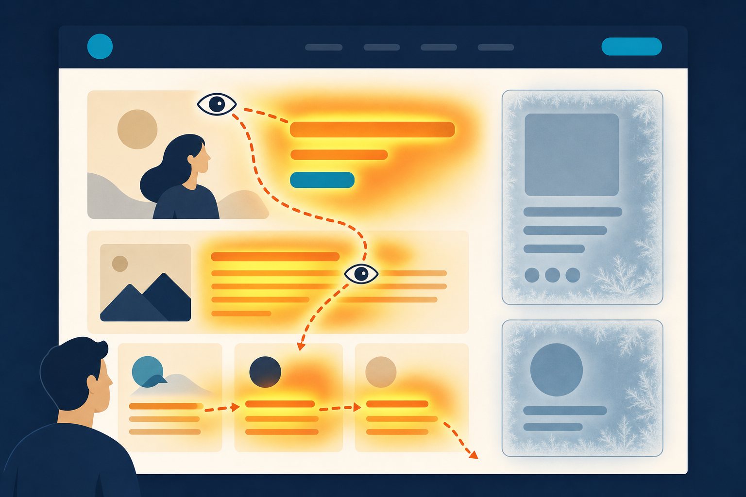
We wanted to know whether this nearly 30-year-old finding still holds up in 2026, so we built a homepage of the kind that exists a thousand times over in the B2B software market: an accounting-software vendor for small and mid-sized businesses, five clearly defined zones, two of them unmistakably promotional.
How did we test this?
The homepage has five zones, described in text and identical for every twin: Zone A: logo and navigation bar, top left. Zone B, the central headline „Buchhaltung, die sich selbst erledigt“ (“Accounting that takes care of itself”) with a blue „Kostenlos testen“ (“Try for free”) button. Zone C, a product screenshot to the right of the headline. Zone D, an animated promotional banner in the right sidebar, „Nur heute: 20 % Rabatt!“ (“Today only: 20% off!”). Zone E, a banner in the bottom-right corner, „Newsletter abonnieren und nichts verpassen“ (“Subscribe to our newsletter and never miss out”).
We asked the full twin panel two questions, each in two reversed orders of the zone listing (A→E and E→A) to surface position effects: “Where does your eye land first?” and “Which zone would you be most likely to overlook or consciously ignore?”
The Method: The layout was described in text. There is no real eye-tracking in this test. The twins self-report where their gaze lands and what they’d ignore, a proxy for attention, not a substitute for gaze measurement. The panel responded in German; quotes are translated. n = 10 digital twins (DACH consumer panel, ages 25–60), 4 stateless panel calls (2 questions × 2 orders), 0 parse errors. Every one of the 40 answers returned an unambiguous letter.
Important context on the construct: Benway & Lane and Nielsen measured unconscious missing of relevant content, or gaze fixations, during real usage tasks. Our twins read all five zones by design and then explain what they’d consciously ignore, so we’re measuring explicit ad-blindness, not unconscious overlooking of relevant content. On the robustness of the finding: 7 of 10 twins picked a promotional zone in both runs, 10 of 10 in at least one; excluding the one answer with a mismatched rationale (Dennis, below), the share is 89 percent (17 of 19).
One answer diverges on content: in the first run of the ignore question, Dennis Altmann clearly named letter A, but justified the pick with “company history and founders”, content that doesn’t appear anywhere in the Zone A stimulus (which is just the logo and navigation bar). We count the answer as a Pick A and report the rationale mismatch separately here. The order-driven swing in the first-glance question (30% in the first run, 90% in the second) is also addressed below.
Important: this is one test of one B2B software vendor’s layout, not a universal law for every website.

Beate Hofmann, 58
Project manager twin* · Stuttgart · University degree
“I’m Beate Hofmann, a project manager from Stuttgart. Since my divorce I’ve found new stability with a new partner, and even though I’m living with chronic back pain and an active cancer diagnosis, I stay active with daily exercise and feel deeply satisfied with my life.”
What makes this twin distinct: I hold strong private religious beliefs without attending church, I’m deeply skeptical of politics and the economic situation, and I guard my data so carefully that I’ll pass up a discount rather than share it.
* Digital twin: an AI simulation based on a real person’s profile: 68+ survey items, a full psychographic profile (values, demographics, behavior). Not a real person.
Sabine Wagner, 56
Nurse twin* · Leipzig · Upper secondary education
“I’m Sabine Wagner, a nurse at a hospital in Leipzig. I’m married and live with my husband, but between 40-hour shift work and running the household, I have almost no time left for myself.”
What makes this twin distinct: My faith isn’t just tradition. It’s an active source of strength for a demanding job, I place strong trust in the police and the justice system, and despite my packed hospital schedule I still volunteer for charitable causes.
* Digital twin: an AI simulation based on a real person’s profile: 68+ survey items, a full psychographic profile (values, demographics, behavior). Not a real person.

Kathrin Baumann, 32
Teacher twin* · Munich · Postgraduate degree
“I’m Kathrin Baumann, a primary school teacher from Munich. I’m married with two young children, and life right now is turbulent between school and a young family. Exercise has taken a back seat.”
What makes this twin distinct: I trust people deeply and tend to look for the good in them, I lean politically left and feel close to the Greens, and I consistently boycott products for sustainability reasons even though politics otherwise takes a back seat in my daily life.
* Digital twin: an AI simulation based on a real person’s profile: 68+ survey items, a full psychographic profile (values, demographics, behavior). Not a real person.

Melanie Schubert, 33
Bank clerk twin* · near Frankfurt · Advanced vocational education
“I’m Melanie Schubert, a bank clerk at a large company near Frankfurt. I’m married and live with my husband, though occasional back and neck issues slow me down a bit in daily life.”
What makes this twin distinct: I’m considerably more risk-averse than most people around me, I avoid leadership roles and deliberately limit my own time online even though I’m perfectly capable with technology. Order and reliability matter more to me than trying new things.
* Digital twin: an AI simulation based on a real person’s profile: 68+ survey items, a full psychographic profile (values, demographics, behavior). Not a real person.

Lukas Sander, 33
Retail twin* · Dortmund · Postgraduate degree
“I’m Lukas Sander, a retail employee with team-lead responsibility in Dortmund. I’m married with three children aged two, four, and seven, between a 40-hour work week and a full family life, I feel very satisfied and firmly in control.”
What makes this twin distinct: Even though I’m security-oriented and risk-averse, I strongly support minority rights, including LGBTQ rights, and want a strong, socially active government, and my postgraduate degree gives me an unusual outside perspective on my retail job.
* Digital twin: an AI simulation based on a real person’s profile: 68+ survey items, a full psychographic profile (values, demographics, behavior). Not a real person.

Anke Schumann, 48
HR twin* · Hamburg · University degree
“I’m Anke Schumann, an HR officer at a mid-size company in Hamburg. I’m married, have two sons, and feel deeply fulfilled and settled in my life.”
What makes this twin distinct: I place strong trust in parliament and the justice system even though the economic situation leaves me dissatisfied, I champion income equality and minority rights, and yet I also see obedience and respect for authority as core parenting values, a contradiction I notice in myself.
* Digital twin: an AI simulation based on a real person’s profile: 68+ survey items, a full psychographic profile (values, demographics, behavior). Not a real person.

Sören Lindner, 30
IT twin* · Cologne · Advanced vocational education
“I’m Sören Lindner, an IT administrator at a large company in Cologne. I’m not married and live with my partner. My childhood was shaped by financial hardship and family conflict, which made me more risk-tolerant and determined as an adult.”
What makes this twin distinct: I’m unusually risk-tolerant and drawn to leadership, I protest and donate for causes I believe in, I guard my data strictly despite my strong tech affinity, and I actively oppose workplace inequality for women.
* Digital twin: an AI simulation based on a real person’s profile: 68+ survey items, a full psychographic profile (values, demographics, behavior). Not a real person.
Tobias Hübner, 35
Mechatronics twin* · Essen (Ruhr area) · Upper secondary education
“I’m Tobias Hübner, a mechatronics technician at a mid-size electronics manufacturer in Essen, in the Ruhr area. I’m not married and live in a large six-person household with my parents and younger relatives, chaotic, but a strong source of security for me.”
What makes this twin distinct: I put several hours a week into caring for relatives and neighbors rather than outward-facing social activities, I consistently reject tracking cookies, and I still vote regularly even though I feel my vote carries little real weight.
* Digital twin: an AI simulation based on a real person’s profile: 68+ survey items, a full psychographic profile (values, demographics, behavior). Not a real person.

Dennis Altmann, 41
Sales twin* · Düsseldorf · University degree
“I’m Dennis Altmann, a sales rep at a mid-size wholesale company in Düsseldorf, and I travel frequently for work. I’m married with three children. My own childhood was marked by financial strain and conflict, which is why I want a more stable, harmonious home for my own kids.”
What makes this twin distinct: Unlike Düsseldorf’s generally liberal environment, I place high value on clear rules, order, and traditional parenting values like obedience and respect for authority, I meet strangers with healthy skepticism; my father originally came from Turkey.
* Digital twin: an AI simulation based on a real person’s profile: 68+ survey items, a full psychographic profile (values, demographics, behavior). Not a real person.

Jürgen Krause, 59
Accountant twin* · Berlin · Upper secondary education
“I’m Jürgen Krause, an accountant nearing retirement in Berlin. I’ve never married and live with two older relatives I care for about 15 hours a week, while dealing with back and joint pain and occasional severe headaches.”
What makes this twin distinct: I’m socially and culturally conservative, value tradition and respect for authority, and feel little connection to the European idea despite living in a cosmopolitan city, yet I still vote SPD because social and income justice matter to me.
* Digital twin: an AI simulation based on a real person’s profile: 68+ survey items, a full psychographic profile (values, demographics, behavior). Not a real person.
* Digital twins are AI simulations based on real person profiles, not real people. Click a twin to see what it is based on.
What we tested
Zone A · Logo/Navigation 10% ignore share
Logo and navigation bar, top left.
Zone B · Headline + CTA 0% ignore share
„Buchhaltung, die sich selbst erledigt“ (“Accounting that takes care of itself”) with a blue „Kostenlos testen“ (“Try for free”) button.
Zone C · Product screenshot 5% ignore share
Product screenshot to the right of the headline.
Zone D · Discount banner (sidebar) Dead zone · 50%
Animated promotional banner, „Nur heute: 20 % Rabatt!“ (“Today only: 20% off!”).
Zone E · Newsletter corner banner Dead zone · 35%
Banner in the bottom-right corner, „Newsletter abonnieren und nichts verpassen“ (“Subscribe to our newsletter and never miss out”).
Which zones do users actually overlook?
Benway and Lane showed in 1998 that users systematically overlook advertising-like layout zones. In our test, 85 percent of the 20 answers to the ignore question named one of the two promotional zones: 50 percent (10 of 20) named the animated discount banner in the sidebar, 35 percent (7 of 20) named the newsletter banner in the corner, measured as explicit ignore-intent, well above the 40% chance baseline (two of five zones). Grouping the two promotional zones together was fixed by the design in advance, and each one individually also beats every non-promotional zone on its own. The central headline with the CTA button got zero of 20 votes on this question. It’s the exact opposite of a dead zone.
The finding holds across both orders: combined ignoring of the discount and newsletter banners came in at 80 percent in the first run and 90 percent in the second, a result that makes the finding robust, regardless of which order the twins saw the zones in.
Beate Hofmann sums up the rejection of the discount banner: “I’d definitely ignore the animated banner D, ‘Today only: 20% off!’ … An offer that only runs ‘today’ and gets pushed with an animated banner comes across as a bit unserious to me, and it just distracts from the actual product. I don’t let myself get pressured by that kind of thing,” says Twin “Beate Hofmann” (digital twin, DACH consumer panel). Sören Lindner spells out the filtering logic behind it: “Banners like that are pure marketing noise to me. They distract from the actual product information, and I’m used to filtering them out so I can focus on the content,” says Twin “Sören Lindner” (digital twin, DACH consumer panel).
Where does the eye look first, and why is this only a directional finding?
On the first-glance question, the central headline with CTA button pulls in 60 percent of all 20 answers (12 of 20), well ahead of the discount banner (15%), logo/navigation and product screenshot (10% each), and the newsletter banner (5%). Unlike the ignore question, though, this figure swings hard between the two orders: only 30 percent picked the headline in the first run, versus 90 percent in the second. We’re reporting the 60 percent explicitly as a directional finding, not a reliable effect size. The ignore question, with its stable 80/90 range, is the result you can actually rely on.
Kathrin Baumann shows, in the second run, why the headline pulls attention: “The headline ‘Accounting that takes care of itself’ promises huge relief for everyday work, which is extremely appealing to me as a primary school teacher with a 40-hour week and two small kids. The blue ‘Try for free’ button makes the offer even more accessible and risk-free,” says Twin “Kathrin Baumann” (digital twin, DACH consumer panel). Every rule has an exception: on the same question, Sabine Wagner’s eye landed on the newsletter banner instead. Her curious-but-cautious persona made the no-commitment “never miss out” the first thing she noticed.
Catching the eye and still getting ignored: the case of Melanie Schubert
A single twin shows how little first-glance and ignoring actually exclude each other. In the first run, Melanie Schubert picked the discount banner as the zone her eye landed on first: “’D’ jumps out at me immediately, the animated promotional banner with the discount … When I shop day to day I pay a lot more attention to deals and discounts because money’s gotten tighter, and an animated banner saying ‘Today only: 20% off!’ would grab my attention right away,” says Twin “Melanie Schubert” (digital twin, DACH consumer panel). On the ignore question, the same Melanie Schubert named the discount banner again in the first run, this time citing tracking concerns as her reason, saying she’s become cautious online and associates animated banners with data collection. The brief glance at the promotional zone and her later conscious filtering of it fit together. Both are moments of the same price-conscious caution.
Classic study
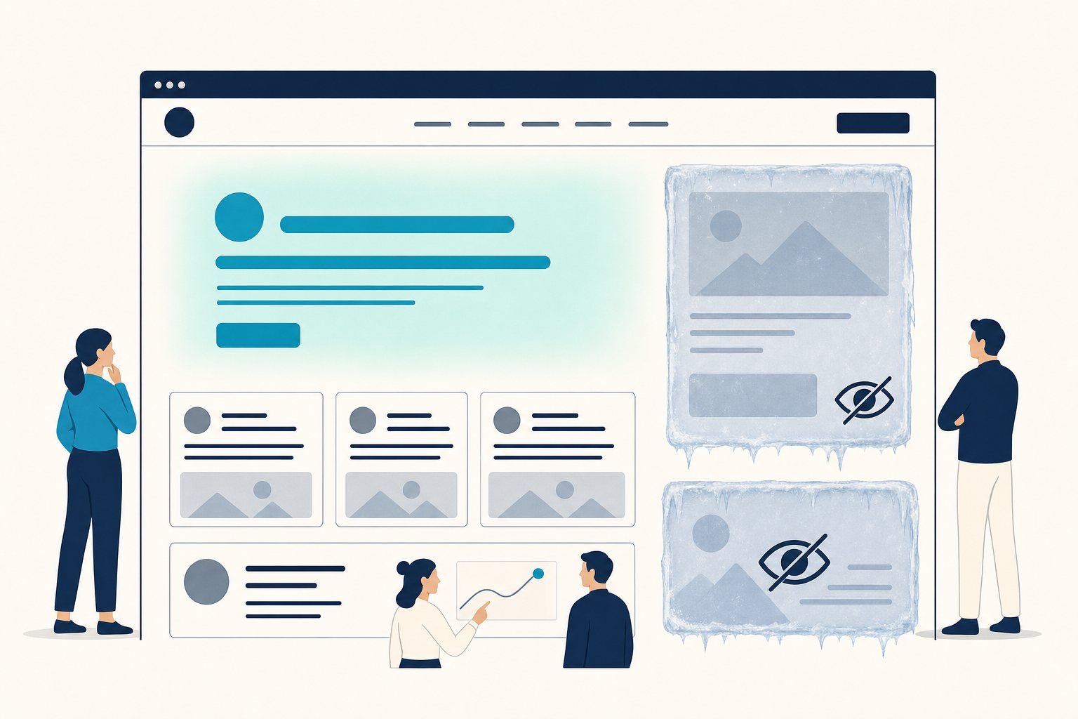
Benway & Lane (1998): Users systematically overlook layout areas that look like advertising, even when relevant content sits right there.
Digital Twins (2026)
85% of the ignore answers (17 of 20) fall on the two promotional zones, stable across two reversed orders.
Same principle, measured fresh: in minutes instead of weeks of fieldwork.
What does this mean for your website layout?
The practical takeaway from this one test: if you’re marketing a B2B software product, treat the headline and call-to-action in the center of the page as the real attention hub, and plan for sidebar and corner banners as zones that most visitors will actively filter out. Whether this result transfers to other industries, audiences, or layout variants is something every test has to show for itself, which is exactly what digital twins are for: fast, cheap answers before you build or rebuild your own homepage.
Want to know if your own homepage lands in the dead zone? Book my talk “Why Consumers Buy Weird”: including a live demo of how digital twins test attention and blind spots in minutes.
This test is part of The Trigger Lab series, in which we re-examine classics of consumer psychology with digital twins. You’ll find the full overview of all re-tests soon in the flagship article “Brainfluence Retested” (coming soon at jonathanmall.com/en/trigger-lab-brainfluence-retested/).
Further reading
- Roger Dooley vs. Jonathan Mall: Who’s Right About Brainfluence?
- Digital Twins in Market Research: The Complete Guide 2026
- Digital Twins vs. Focus Groups: Method Comparison 2026
Frequently asked questions
Is there really a “dead zone” on websites?
Yes, unambiguously in our test: 85 percent of the 20 answers to the ignore question (17 of 20) fell on the two promotional zones: the animated discount banner (50%) and the newsletter corner banner (35%). The figure was stable across two reversed orders (80% vs. 90%). The central headline with CTA button, by contrast, got zero of 20 votes on the ignore question.
What is banner blindness?
Banner blindness describes users’ tendency to systematically overlook or consciously ignore layout areas of a website that look like advertising, regardless of what’s actually in them. Benway and Lane first documented the effect in 1998, Jakob Nielsen confirmed it in 2007 with eye-tracking studies, and Roger Dooley calls the affected areas the “corner of death” in Brainfluence (2011).
Where do visitors look first on a website?
The first-glance question swung hard between the two orders: in the first run only 30 percent of twins picked the central headline with CTA button, where it was even just tied with the discount banner (3 votes each), while the second run saw 90 percent (pooled: 60 percent, 12 of 20). We treat the figure as a directional finding only, not a reliable effect size, unlike the stable ignore question.
How do you test banner blindness without eye-tracking?
We had digital twins from a DACH consumer panel (ages 25–60) evaluate a text-described five-zone layout of a software homepage, with no real eye-tracking, but with self-reported first-glance and ignore judgments. Four stateless panel calls (2 questions × 2 reversed orders) produced 20 answers per question and 0 parse errors.
Glossary: The Trigger Lab vocabulary
Digital Twins: AI personas grounded in real survey profiles that respond to text stimuli with forced-choice decisions and ratings: a market-research panel that answers in minutes instead of weeks. → Learn more: Digital Twins in Market Research: The Complete Guide
The Trigger Lab: the article series in which classics of consumer psychology are re-tested live with digital twins from a DACH consumer panel. → See the experiment: Brainfluence Retested
Trust Words: fixed trust phrases placed under the buy button, money-back guarantees, customer reviews, or certification marks, that, per Dooley (Brainfluence, 2011), raise perceived trust and purchase intent. → See the experiment: Ten Words That Build Trust
First Impressions (50 Milliseconds): the finding that visitors form a design judgment about a website in roughly 50 milliseconds, with visual simplicity beating dense design (Lindgaard et al., 2006; Tuch et al., 2012). → See the experiment: The First 50 Milliseconds
Faces Effect (Eye Magnet): faces draw the eye (Dooley, 2011); the gaze direction of a pictured face further directs attention (Hutton & Nolte, 2011, not testable in our text format). → See the experiment: Faces, Eyes, Attention
Cognitive Fluency: the principle that easy-to-process design, clear type, short sentences, high contrast, makes tasks and offers feel more effortless and trustworthy than hard-to-process design (Song & Schwarz, 2008). → See the experiment: Does the Wrong Font Cost You Conversions?
Surprise Trigger (Expectation Gap): headlines that break an expectation or promise a surprise earn higher click intent, per Dooley (Brainfluence, 2011), than plain announcements or bare FREE/NEW signals. → See the experiment: Headline Triggers: FREE, NEW, and the Surprise Reflex
Decoy Effect: a deliberately unattractive, expensive third option in a pricing menu shifts buyer choice toward the middle, pricier option, without being chosen itself (Ariely, 2008). → See the experiment: Pricing Psychology 2.0: The Decoy Effect
Friction: every extra step, every extra required field, and every forced account creation in checkout lowers the odds of completing the purchase. Guest checkout beats forced accounts (Dooley, Friction, 2019). → See the experiment: Friction Audits, But Testable
Banner Blindness (Dead Zone): users systematically overlook page areas that look like ads or sit in typical ad positions: the “corner of death” in the right sidebar and bottom corner (Benway & Lane, 1998; Nielsen, 2007; Dooley, 2011).
Simple Slogans (Rhyme-as-Reason): short, concrete slogans are remembered better and land as more persuasive than complex or abstract phrasing; rhyme and wordplay amplify this effect further because they make plain statements feel truer (Dooley, 2011; McGlone & Tofighbakhsh, 2000). → See the experiment: Simple Slogans, Measured
Pick Share (Forced Choice): the share of twins who, in a forced-choice question with no “don’t know” option, choose a given variant, averaged across two oppositely ordered runs.
Allocation Measure: a question technique where twins state, for each variant, how many of 10 purchases or situations they would choose it in, yielding a realistic distribution instead of a single yes/no snapshot.
Sources & further reading
- Benway, J. P. & Lane, D. M. (1998). Banner Blindness: Web Searchers Often Miss ‘Obvious’ Links.
- Nielsen, J. (2007). Banner Blindness: Old and New Findings. Nielsen Norman Group.
- Dooley, R. (2011). Brainfluence: 100 Ways to Persuade and Convince Consumers with Neuromarketing. Wiley. (Web-layout chapters, “corner of death”)
- Trigger Lab Experiment F6, 2026, n = 10 digital twins (neuroflash).
Get the same scientific power for your own marketing: Use the digital twins from this experiment yourself: via the neuroflash Digital Twins MCP directly inside Claude or Cursor, or in your browser at neuroflash.com. Your stimuli, the same panel principle, results in minutes.
Dr. Jonathan T. Mall
Cognitive neuropsychologist, AI entrepreneur, and Chief Innovation Officer at neuroflash. Jonathan combines 20+ years of experience in neuroscience and AI to predict how people decide. His signature talk “Why Consumers Buy Weird” explains why we buy irrationally, and how digital twins predict it. If you want to experience these insights live, you can book an AI keynote with live demos. LinkedIn · Keynote inquiry